
There is something about the way light catches a hand in late autumn that makes nail color feel less like decoration and more like punctuation. A deep burgundy against a wool cuff, a shimmer of gold leaf on a short square nail, a quiet grey almond shape resting on marble — November nail colors for 2026 settle into the season the way a well-chosen scarf settles against a coat collar. The palette is wide, but the temperature is consistent.
What makes this collection worth studying is that it operates as a design language rather than a single directive. Across these twenty-three sets, the variables that matter most are finish, shape, contrast, and motif placement. A matte fuchsia coffin nail and a glossy cherry round nail both belong to autumn, but they speak differently because of how their surface interacts with proportion and how their color sits against skin tone. The range here moves from restrained single-shade applications to layered mixed-media sets, and the through-line is always deliberate choice rather than maximalism for its own sake. Each section below reads one image closely, identifies what the nail set is doing visually, and pulls out the transferable principle behind it. The goal is not to copy a manicure but to understand why a particular combination of color and seasonal style reads as considered rather than accidental.
1. White Glitter Almond With Nude French Accent
The hand shows almond-shaped nails in two alternating designs. Some nails carry a full coat of white iridescent glitter with a slightly textured surface, while others feature a nude base with a white curved French tip separated by a thin line of gold glitter. The nails are medium-long, and the hand wears a ring on the index finger. A lavender fuzzy sleeve is partially visible at the wrist.
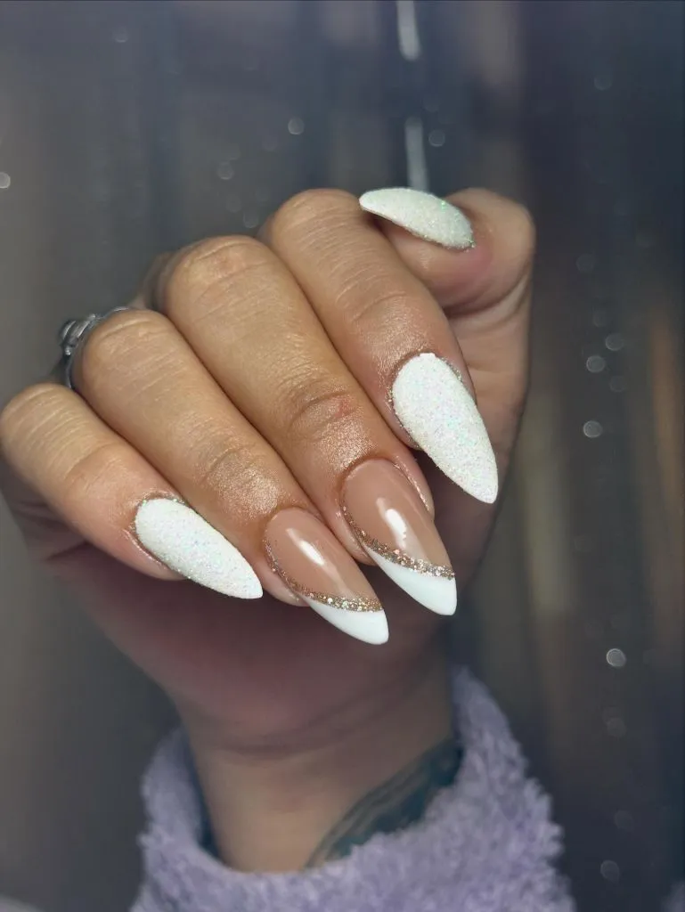
Photo via Instagram
The alternation between full-coverage glitter and the cleaner French design creates a rhythm across the hand that prevents either pattern from becoming monotonous. The gold glitter accent line on the French nails is narrow enough to read as a border rather than a feature, which keeps the nude base breathing. The iridescent white picks up faint rainbow shifts depending on angle, adding dimension without introducing a new color. The eye moves between the two nail types rather than settling, which gives the set a sense of quiet animation that a single-design approach would not achieve.
The reader takeaway is that mixing two complementary designs across one hand works best when both share a tonal family. Here the white and nude stay close enough in warmth that the alternation feels planned rather than indecisive, and the gold line acts as the thread connecting the two ideas without competing for attention.
2. Lavender Chrome With Gold Foil Detail
A hand displays almond-shaped nails at a medium length, painted in a soft lavender with a pearlescent or chrome finish that shifts between white and lilac depending on the angle. One nail on the ring finger carries a diagonal accent of gold foil, applied in an organic, torn-edge pattern against the same lavender-to-nude gradient. A gold chain ring sits on one finger, and additional rings are faintly visible.
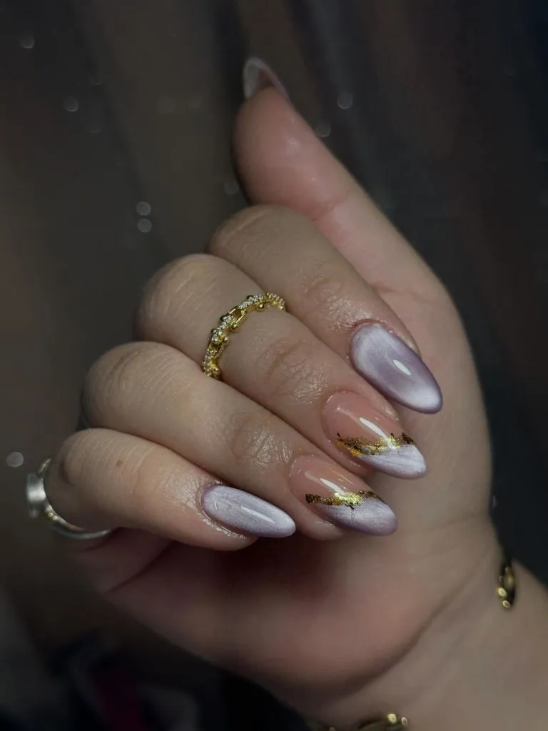
Photo via Instagram
The chrome finish does most of the visual work by introducing light movement across the entire set without requiring a second color. The gold foil on the accent nail functions as an interruption rather than a theme — it appears on only one nail, which gives it the weight of a punctuation mark rather than a pattern. The lavender tone is cool enough to feel autumnal without darkening the hand, and the chrome surface catches the dim lighting in a way that a cream finish would not. The restraint in keeping the foil to a single nail is what holds the balance.
The useful move here is treating a metallic accent as a one-nail event rather than distributing it across the full set. A single point of gold against a uniform cool-toned base reads as intentional placement, and the effect feels closer to jewelry logic than nail art logic.
3. Berry Abstract With Pale Green Blooms
Both hands rest against a pink phone case, showing almond-shaped nails with an abstract design in deep berry, translucent pale green, and white. The colors sit in organic rounded shapes across each nail, and several nails carry small gold stud accents. The patterns vary from nail to nail — no two are identical. A decorative ring is visible on the right hand.
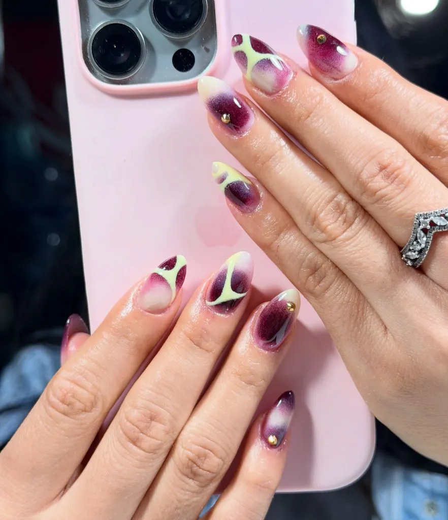
Photo via Instagram
The color combination is unexpected for the season — the pale chartreuse-green would read as spring in isolation, but paired with the deep berry it gains an autumnal weight. The abstract shapes avoid symmetry, which gives the set a painterly quality that rewards close viewing. Each nail feels like a fragment of a larger composition rather than a standalone design, and the gold studs serve as anchoring points that organize the otherwise fluid layout. The contrast between the translucent green and the opaque berry creates depth on each nail surface.
The strongest lesson is that working with an unconventional color pairing can still feel seasonal when the dominant tone carries enough darkness. The berry here does the heavy lifting, and the green serves as a lighter counter-note that keeps the overall palette from becoming somber. That kind of tonal push-and-pull within a single nail art approach creates visual interest without relying on trend-specific motifs.
4. Dusty Blue Chrome on Short Square Nails
Two hands are shown with short, square-shaped nails coated in a dusty blue shade with a chrome or cat-eye finish that creates a vertical light streak down the center of each nail. The nails are kept very short, close to the fingertip. Multiple rings are worn — a rose gold halo-style ring, a silver butterfly ring, and stacked silver bands. A watermark reading “BNTZ Benitez Nails Artist” appears at the lower left.
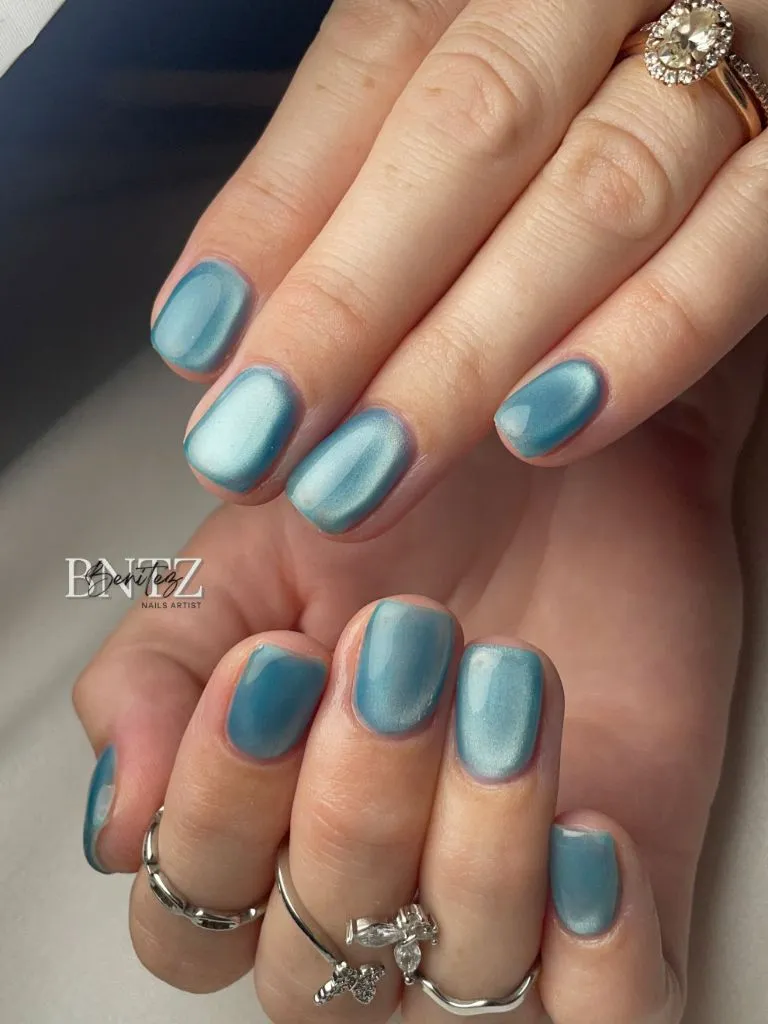
Photo via Instagram
The chrome streak running down each nail mimics the way light falls across a curved surface, and on short nails it creates an optical elongation that a flat matte finish would not produce. The dusty blue sits in a middle register — not pastel, not navy — which allows it to pair with both the warm rose gold ring and the cool silver bands without clashing with either. The short square shape grounds the look in practicality, while the chrome finish lifts it into something more considered. There is a productive tension between the length and the surface treatment.
The useful idea is that a chrome or cat-eye finish on very short nails compensates for the reduced surface area by introducing light movement. The vertical streak draws the eye along the nail rather than across it, and that directional pull gives even the smallest nail a sense of visual length that complements accessory choices around the hand.
5. Silver French Tips on Nude Almond Base
Both hands are shown together, fingers interlaced, displaying medium-length almond nails with a sheer nude or pink base and French-style tips done in metallic silver chrome. The silver wraps the free edge in a thin, slightly irregular band that catches light sharply. Several silver rings are worn, including a winged design on the index finger and a floral or vine pattern on the right hand.
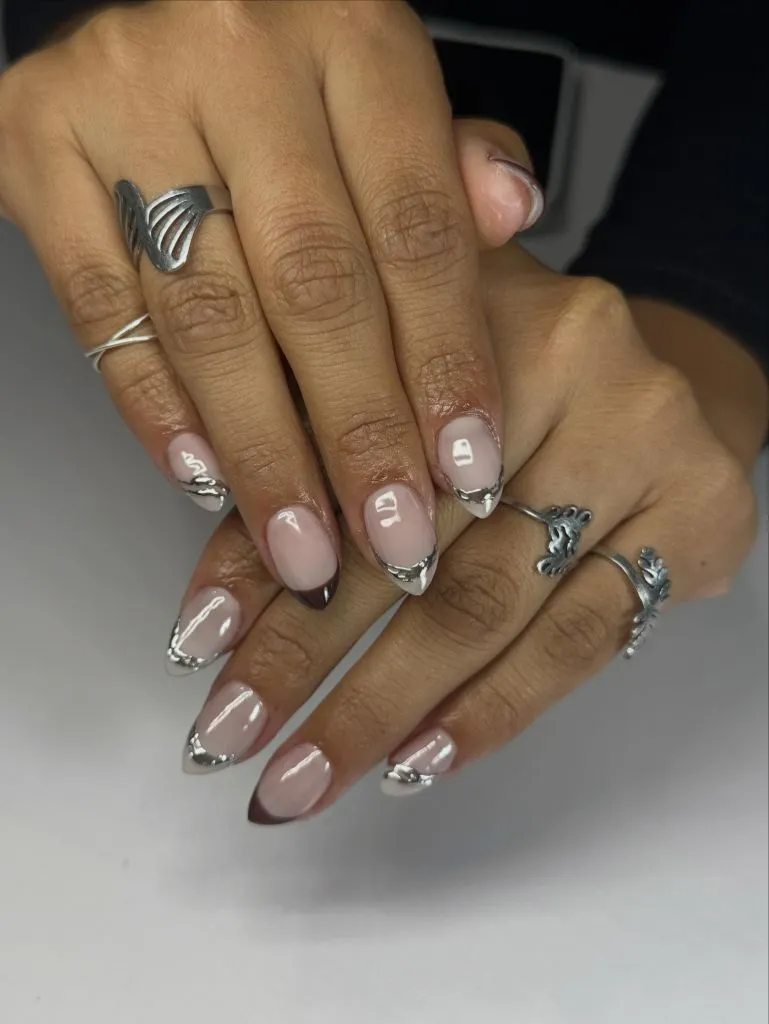
Photo via Instagram
The silver chrome tips function almost as an extension of the rings themselves — the metal finish links the nail edge to the jewelry in a way that a white French tip would not achieve. The nude base is kept sheer enough that the natural nail shows through, which gives the hand a clean, low-effort quality that contrasts with the high-shine tips. The almond shape tapers the finger visually and gives the silver tip a pointed frame that sharpens its effect. The coherence between the ring metal and the tip finish creates a unified zone of silver across the hand.
What stands out most is how matching the tip finish to the jewelry metal creates a continuous visual circuit around the hand. The silver reads as a material choice rather than a color choice, which roots the whole look in a tactile logic. That kind of material matching — where the nail finish echoes what is already on the fingers — gives even a simple French design a quiet sense of coordination.
6. Mixed Media Almond With Chocolate Relief
A hand displays long almond nails in four different designs. The pinky carries a nude base with leopard print accents near the cuticle. The ring finger shows a translucent amber base with 3D textured gel or acrylic elements resembling crushed or molten material. The middle finger wears a red-and-white swirl or marble pattern. The index finger features a dark chocolate brown with raised 3D relief lines forming a leaf or petal pattern. Rings reading “Amor” and other text are visible.
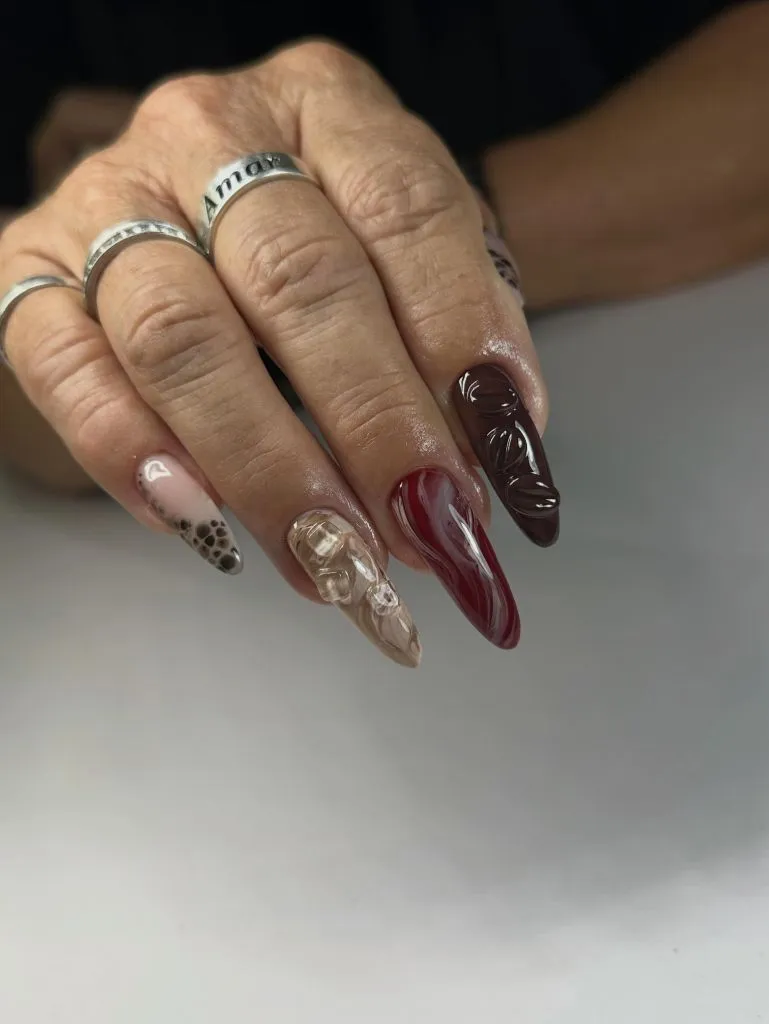
Photo via Instagram
Each nail operates as its own design statement, but the four share a tonal range that holds the set together — nude, amber, oxblood, and chocolate all sit within a warm autumn spectrum. The 3D relief on the index nail adds a tactile element that most nail sets avoid, and it reads as sculptural rather than decorative. The leopard print on the pinky is the most literal motif, but its placement on the smallest nail keeps it from dominating. The marble swirl on the middle finger provides a transitional tone between the warm neutral and the deep chocolate, and this sequencing across the fingers feels deliberately composed.
The best move here is assigning each finger a different technique while keeping the palette unified. The variety holds attention across the hand, but the warm tonal range prevents it from reading as chaotic. That balance between varied design elements and consistent color temperature is the principle that makes mixed-media sets feel cohesive rather than random.
7. Royal Blue Shimmer With Floral Accent Nail
A hand holds its fingers together, showing medium-long almond nails. Four nails are painted in a deep royal blue with a shimmer or micro-glitter finish that gives the surface a slight sparkle. One accent nail, the ring finger, has a milky white or sheer pink base with a small blue flower design and a tiny gold bead at its center. The thumb carries the same royal blue. A gold wavy ring sits on the index finger.
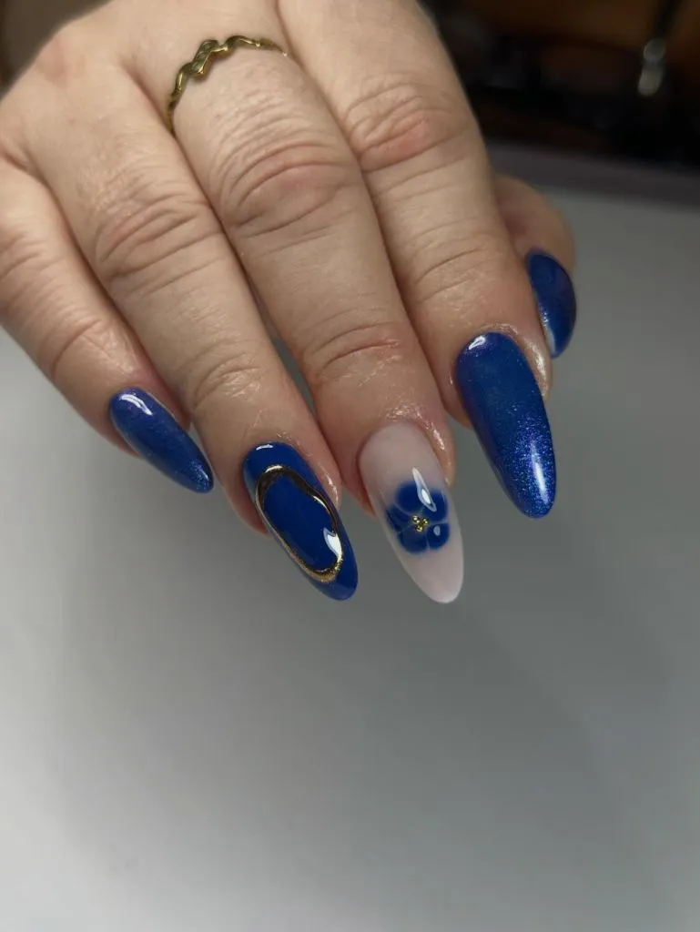
Photo via Instagram
The royal blue is rich enough to feel like a statement, but the shimmer finish keeps it from appearing flat or heavy. By placing the single floral accent on a contrasting milky base, the design creates a natural focal point on the ring finger that the eye finds quickly. I like how the small gold bead at the flower’s center echoes the gold ring above it — a small detail that links the nail art to the accessories without being literal about it. The blue works seasonally because its depth matches the shorter daylight hours of November, and the shimmer surface catches whatever light is available.
The reader takeaway is that a single accent nail works most effectively when its base color contrasts with the dominant set while its motif color matches it. The blue flower on white links back to the four blue nails, creating a bridge between the accent and the main color. That internal echo — motif matching the surrounding nails — is what makes the accent feel integrated rather than orphaned.
8. Deep Cherry on Short Rounded Nails
A hand is shown in a loose fist, displaying four short, rounded nails coated in a deep cherry or oxblood shade with a high-gloss finish. The nails are trimmed close to the fingertip with minimal free edge. A tattoo is partially visible on the wrist. The background is a plain light surface.
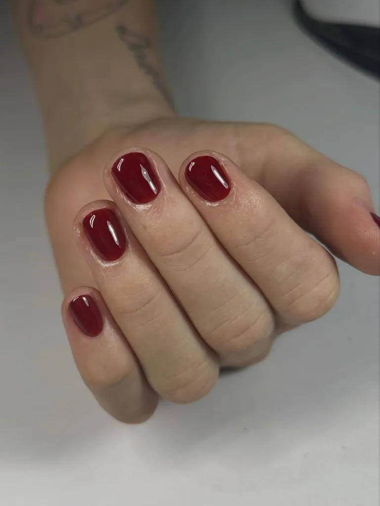
Photo via Instagram
The simplicity here is the strategy. A single dark shade on a short, rounded nail produces a compact, saturated block of color on each finger that reads as clean and deliberate. The high-gloss finish amplifies the depth of the cherry tone, making it appear almost lacquered. There are no accents, no mixed designs, no texture — the entire visual interest comes from how deeply the color sits against the skin and how the light pools on the curved glossy surface. The short length keeps the color from feeling dramatic and instead positions it as a seasonal staple approach.
The useful move here is recognizing that depth of color and quality of finish can carry a nail set entirely on their own. No accent nail or mixed technique is needed when the shade is this saturated and the gloss is this reflective. That economy — one color, one finish, no embellishment — works best on shorter nails where each surface is small enough to function as a concentrated point of color.
9. Warm Taupe With White Leaf Linework
A hand shows medium-length oval nails painted in a warm taupe or mocha shade with a glossy finish. Two nails — the index and middle fingers — carry white hand-painted leaf or vine linework over the taupe base, with small leaf shapes branching from a central stem. The remaining nails are plain taupe. Beaded and woven bracelets in red and gold are visible at the wrist.
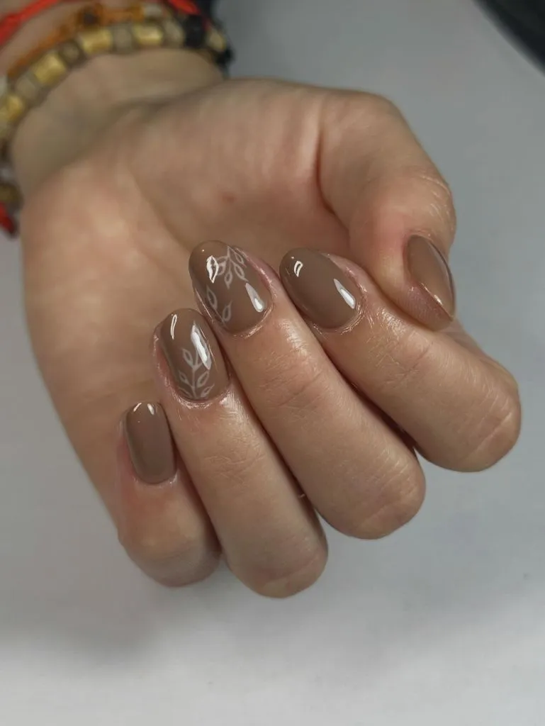
Photo via Instagram
The taupe base anchors the set in warmth, and the white linework introduces pattern without introducing a second strong color. The leaves are drawn with thin lines that sit on top of the gloss, giving them a slightly raised or sticker-like quality that contrasts with the smooth base. By limiting the linework to two nails, the design avoids becoming busy and instead creates a zone of detail that the eye visits before returning to the calm of the plain nails. The warmth of the bracelets at the wrist reinforces the overall warm register of the set.
The strongest lesson is that botanical motifs on a neutral base succeed when they remain linear rather than filled. White line drawings on taupe read as delicate notation rather than bold illustration, and that lighter touch allows the base color to remain the dominant visual element. Keeping the motif on only a portion of the nails gives the hand breathing room between the decorated and the plain.
10. Autumn Leaf Foil on Brown and Nude
A close-up of four fingers shows short, square nails alternating between a dark chocolate brown and a nude or beige shade. Each nail carries a small gold leaf or branch motif, painted or applied as foil, positioned at slightly different angles across the nail surface. The designs are delicate and vary in size. The background is a soft grey.
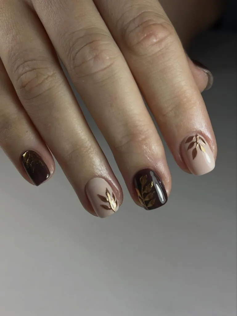
Photo via Instagram
The alternation between dark brown and nude creates a strong contrast rhythm across the hand, and the gold leaf motif appears on both base colors, which stitches the two tones together into a single narrative. The gold reads differently on each background — warmer and more subtle against the nude, brighter and more defined against the chocolate — which gives the same motif two distinct readings within one set. The short square shape provides a flat canvas that suits the small botanical illustrations, and the motif’s varied placement prevents the pattern from feeling like a decal sheet.
What stands out most is how a single motif can unify two contrasting base colors. The gold leaf branch appears on every nail regardless of its background, and that repetition turns what could feel like mismatched polish choices into a coordinated autumn color set. The principle is simple: a shared accent element bridges even sharp tonal jumps between fingers.
11. Pastel French Tips With Heart Gems and Florals
Both hands display very long coffin or tapered square nails. Each nail features a different pastel French tip — mint green, lavender, hot pink, orange, and yellow — on a nude or clear base. Two nails, one per hand, carry large heart-shaped iridescent gems set in rhinestone borders. Other nails feature small 3D flower charms in pink and white. The overall effect is bright, multi-colored, and heavily embellished.
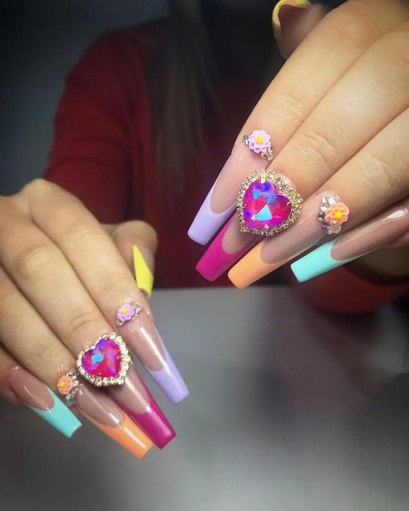
Photo via Instagram
The multi-color French tips could easily overwhelm, but the nude base visible on each nail provides a consistent neutral strip between cuticle and color that organizes the palette. The heart gems are the largest elements and sit centrally on their respective nails, functioning as focal anchors that the smaller flower charms orbit around. The coffin shape elongates each nail enough that the tip color occupies roughly half the visible surface, giving each pastel enough space to register before the next finger introduces a new hue. The 3D elements add literal dimension that lifts the set off the flat plane of traditional polish.
The beauty of this is that a multi-color tip set avoids visual chaos when the base remains constant and the embellishments follow a hierarchy. Here, two large gems outrank the smaller florals, and the tips themselves sit below both in visual weight. That layered ranking — gem, charm, then color block — gives the eye a structured path across a busy hand.
12. Slate Grey Cat-Eye Almond
A hand is positioned against a white marble surface with a green pothos plant in the background. The nails are medium-length almonds in a slate grey with a cat-eye magnetic finish that produces a soft vertical light stripe down the center of each nail. The color is a true mid-grey with a slight cool lean. A thin gold band ring is worn on one finger.
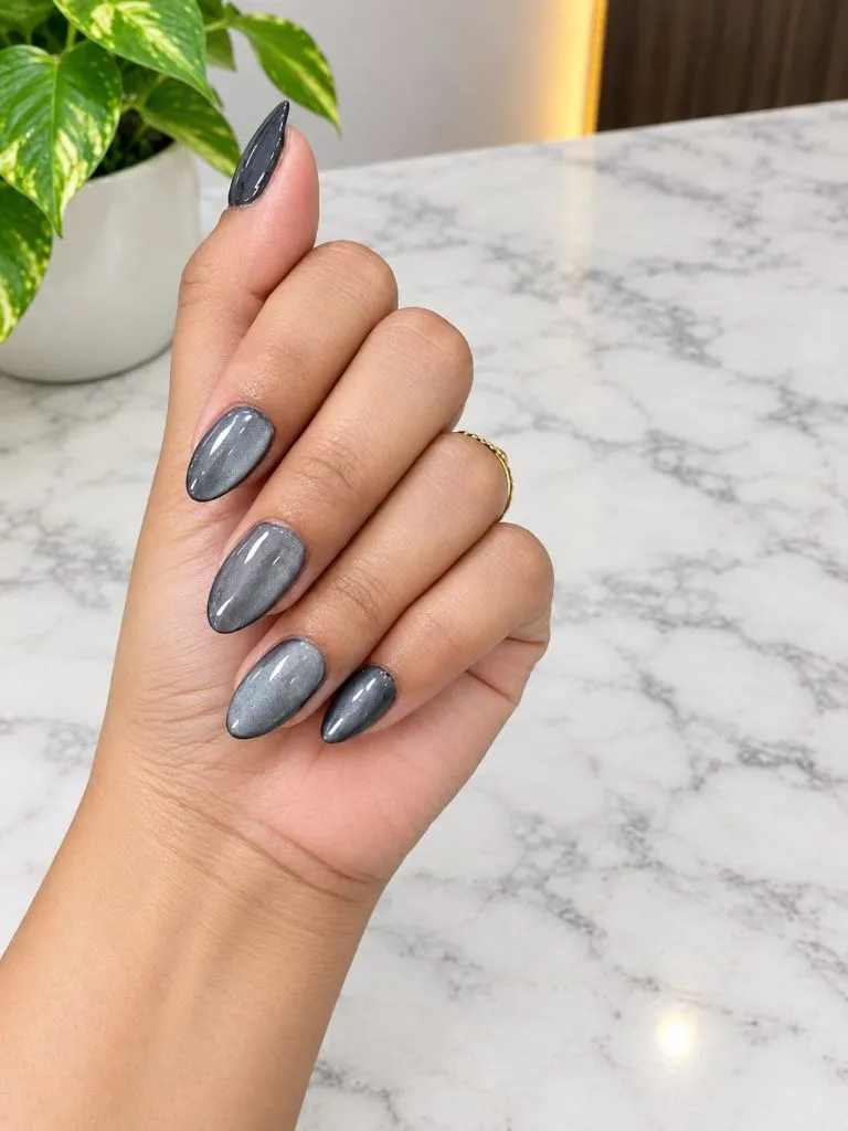
Photo via Instagram
The slate grey occupies a tonal position that feels inherently November — not warm, not cold, not dark enough for evening and not light enough for casual. The cat-eye streak adds the kind of internal glow that keeps the grey from reading as flat or dull, and the vertical orientation of the light stripe mirrors the almond taper, reinforcing the nail’s elongated silhouette. The marble surface in the background creates an unintentional tonal echo with the grey nails, which frames the hand within a cohesive cool palette. The single gold ring provides just enough warmth to prevent the overall impression from becoming entirely monochrome.
The reader takeaway is that grey benefits enormously from a magnetic or chrome finish because the color itself carries no inherent warmth or richness. The cat-eye effect introduces depth and movement that grey in a cream or matte finish would lack, and that added dimensionality is what shifts the shade from neutral afterthought to deliberate seasonal choice.
13. Bold Red on Short Square Nails
Both hands rest together in front of a navy top with a visible brand strap. The nails are short to medium, square-shaped, and painted in a bright, true red with a high-gloss cream finish. The color is even across all ten nails with no visible accents or design. A gold chain bracelet is worn on one wrist. The background suggests an indoor salon or cafe setting with warm lighting.
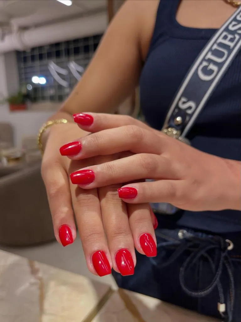
Photo via Instagram
The red is pure — no berry undertone, no orange lean — and on a short square nail it becomes a clean rectangular block of saturated color at each fingertip. The glossy cream finish reflects light in broad, even pools rather than the streaked reflections of a shimmer or metallic, which gives the surface a polished, almost enameled quality. The square shape contributes structural sharpness that a round or almond shape would soften, and that angular quality pairs well with the decisive nature of a primary red. Against the navy clothing, the red pops without clashing, sitting comfortably in a classic complementary color relationship.
The useful idea is that a bright, unmodulated red demands a finish and shape that match its directness. The square edge and high gloss are both assertive choices that align with the boldness of the color itself. Softening either element — rounding the shape, matting the surface — would introduce a contradiction between the color’s intensity and the form’s gentleness.
14. Matte Fuchsia Coffin With Gold Flake Accents
A hand emerges from a white fabric, showing medium-long coffin-shaped nails in two configurations. Some nails are fully coated in a vibrant fuchsia with a completely matte finish. Others feature a diagonal split between the fuchsia and a sheer nude, with scattered gold and black flakes along the dividing line and across the nude portion. The fuchsia has a slight gradient from hot pink to purple across different nails.
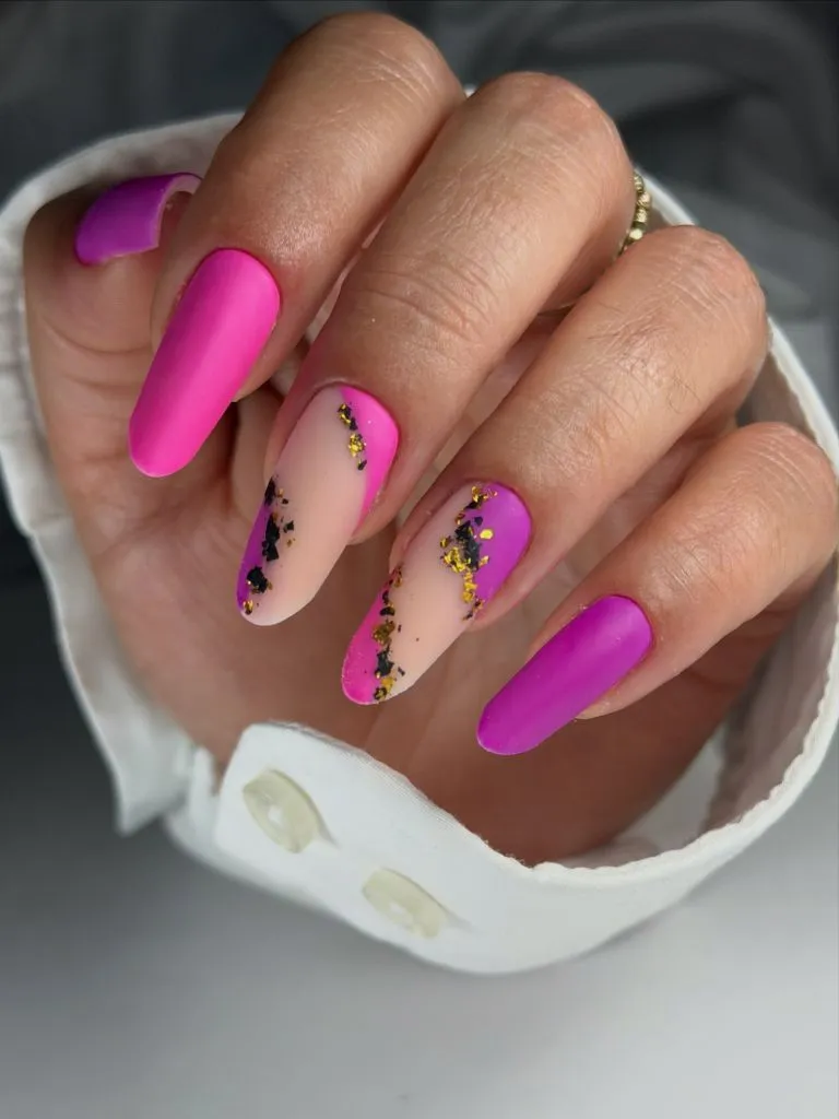
Photo via Instagram
The matte finish on the fuchsia is what gives this set its particular character — the color is intense, but the absence of shine removes the expected glossy energy and replaces it with something more velvet-like and subdued. The gold and black flakes along the diagonal line read as debris caught between two zones rather than precise decoration, which introduces a raw, almost geological quality. The coffin shape elongates the fuchsia blocks into clean slabs of saturated color, and the diagonal nude section creates a triangular window of skin tone that breaks the intensity. This set demonstrates how a November nail color does not have to be dark to feel seasonally appropriate — the matte finish and the rich tonal depth do that work instead.
The best move here is using a matte finish to temper an otherwise high-energy color. The fuchsia would read as summer or party-ready in gloss, but the matte surface absorbs light rather than reflecting it, pulling the entire mood toward something more contemplative and autumnal.
15. Pink-to-Yellow Gradient on Short Oval Nails
A hand is held up with four short oval nails showing a soft gradient that blends from pink at the center to pale yellow near the edges, or vice versa, creating a warm ombre effect. The finish is glossy and smooth. A crown-style ring with small stones sits on one finger, and a beaded bracelet is partially visible. The background is blurred with warm, indoor tones.
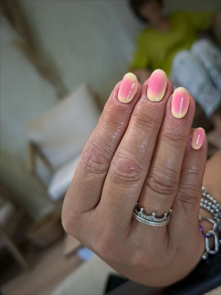
Photo via Instagram
The gradient is gentle enough that neither the pink nor the yellow dominates — the two colors meet in a warm peach zone at the center that softens the transition. On short oval nails, the limited surface area compresses the gradient into a concentrated wash of color that feels intimate rather than expansive. The glossy finish keeps the pastel tones from looking chalky, and the light reflection across the curved oval surface amplifies the blending effect. The crown ring adds a textural counterpoint — faceted metal against smooth polish — that enriches the hand without competing for color attention.
The strongest lesson is that a two-tone gradient on short nails succeeds when the colors sit close to each other on the spectrum. Pink and yellow share enough warmth that their blend produces a natural intermediary rather than a muddy midpoint, and the compressed scale of a short nail makes the transition feel seamless rather than abrupt.
16. Cow Print on Medium Almond Nails
Both hands are displayed together showing medium-length almond nails with a cow print design. The pattern uses irregular patches of dark brown and black over a white or pale pink base. The spots vary in size, shape, and density across each nail, with some nails more white-dominant and others more heavily marked. The finish is high gloss throughout. A ring with a leaf or petal cluster design is worn on the right ring finger.
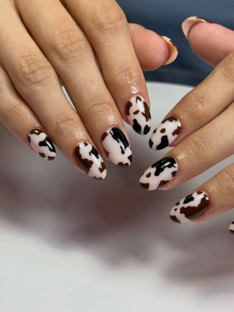
Photo via Instagram
The cow print could easily read as novelty, but the execution here treats it with enough variation to feel organic rather than stamped. Each nail has a different arrangement of spots — some large and pooling, others small and scattered — which mimics the irregularity of actual hide patterns. The combination of brown and black patches adds tonal depth that a simple black-and-white version would not achieve, and the warm brown ties the pattern into the November palette more naturally than pure black would. The almond shape softens the graphic quality of the print, and the high-gloss finish gives the white base areas a porcelain-like surface that contrasts with the matte appearance of the dark patches.
The reader takeaway is that animal-inspired prints feel more sophisticated when the spot shapes are genuinely varied rather than uniformly repeated. Randomizing the scale and density of the pattern across each nail gives the design an illustrative quality that lifts it above sticker-like repetition.
17. Plum Gloss on Medium Almond Nails
A hand displays medium-length almond nails coated in a deep plum or aubergine shade with a high-gloss finish. The color is uniform across all visible nails with no accent designs, gradients, or mixed finishes. The background is dark with a white curved surface above, creating a contrasting frame around the hand. No rings or bracelets are visible.
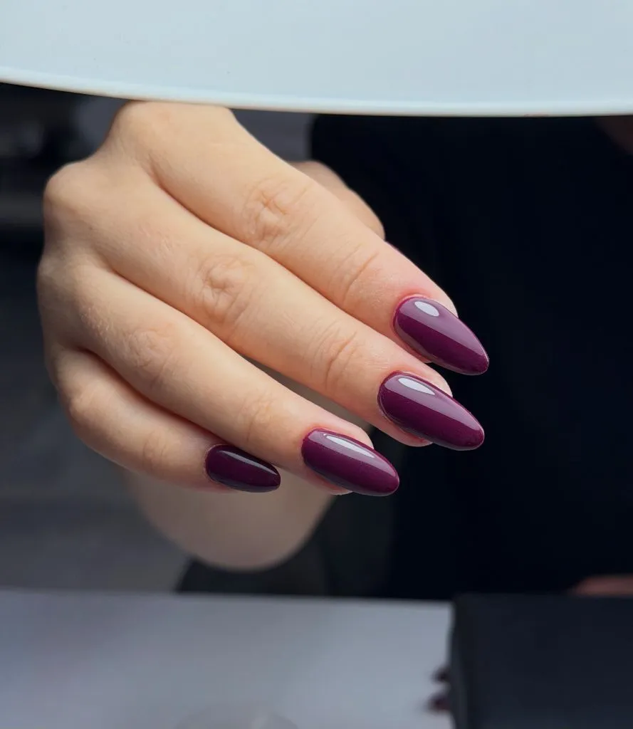
Photo via Instagram
The plum sits in a space between purple and brown that feels unmistakably autumnal, and the high-gloss finish deepens the shade further by creating concentrated pools of reflected light on each nail. The almond shape gives each nail a smooth taper that echoes the rounded curves of the plum tone itself — the shape and color feel matched in their softness. The absence of any accent or secondary element means the entire visual weight rests on the quality of the color and the precision of the application, and both hold up under close viewing. The dark background allows the nails to glow rather than compete.
What stands out most is how a single well-chosen shade at the right depth can carry an entire set without support. The plum is complex enough in its undertones — warm brown threading through cool purple — that it provides its own internal variety. That complexity of a single color, visible as the eye moves across angles and light conditions, replaces the need for pattern or textural contrast.
18. Sunset Ombre on Short Almond Nails
A hand rests against a white ribbed fabric, showing short almond nails with a multi-color ombre that blends through orange, pink, yellow, and blue-violet. Each nail carries the full spectrum but with slightly different dominant zones — some lean more orange, others more violet. The gradients are smooth and airbrushed. No rings or jewelry are visible. The nails have a soft, almost powdery finish.
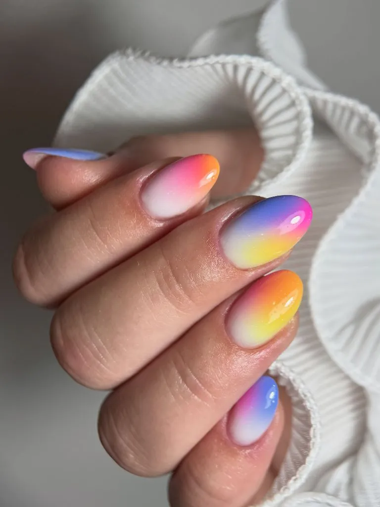
Photo via Instagram
The sunset ombre moves across a wide color spectrum — from warm yellow through pink to cool violet — which is ambitious on a short nail but executed with enough blending finesse that each transition reads as seamless. The variation in dominant hue from nail to nail prevents the set from looking like identical stamps and instead creates the impression of a continuous gradient broken into five fragments. The slightly powdery or satin finish diffuses the color transitions further, avoiding the hard reflections that a high-gloss surface would produce along the blend lines. Against the white fabric, the colors appear vivid without harsh edges.
The useful move here is that each nail in a gradient set can emphasize a different portion of the spectrum. Rather than centering every nail identically, shifting the dominant color zone from finger to finger creates a panoramic effect across the hand. That subtle variation keeps the gradient alive and gives each nail its own identity within the shared color palette.
19. Dark Oxblood on Medium Almond Nails
A hand rests on a pink surface, showing medium-length almond nails in a deep oxblood or dark wine shade with a glossy, almost jelly-like finish. The color is consistent across all visible nails, with a slight translucency at the edges where the nail thins. Silver rings — a wide textured band and a thin band — are worn together on one finger.
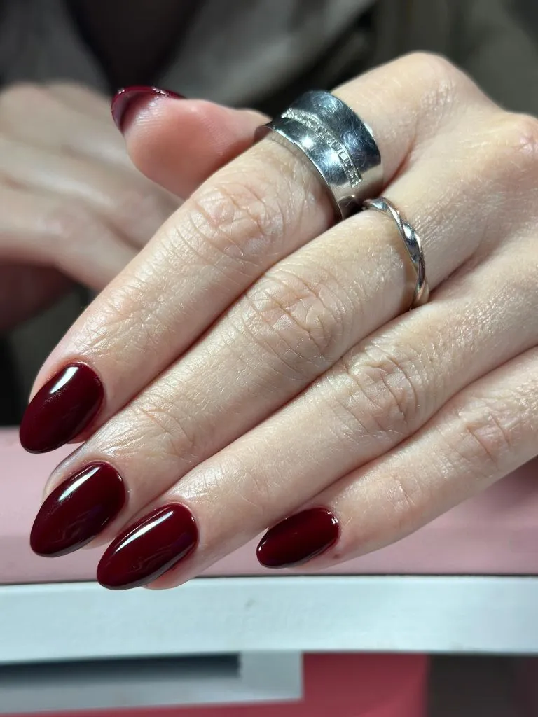
Photo via Instagram
The jelly finish introduces a quality that standard cream polishes do not offer — a depth that comes from the color being slightly transparent, allowing light to enter the surface and bounce back rather than reflecting entirely off the top. This gives the oxblood a glow from within that makes it appear richer than a fully opaque application would. The almond shape keeps the dark color elegant rather than heavy, and the slight translucency at the thinnest edges of each nail creates a natural lighter border that frames the deeper center. The silver rings provide a cool metallic contrast that sharpens the warm darkness of the wine tone.
The beauty of this is that a jelly or translucent finish adds depth to dark shades in a way that opacity cannot replicate. The layered transparency creates the visual equivalent of looking through tinted glass — the color gains dimension and warmth that flat coverage would miss. For deep autumn shades, that glowing quality is often what separates an interesting application from a merely dark one.
20. Stained Glass Rose Art on Short Nails
Both hands are held together showing short, square-to-oval nails with an intricate rose design across all ten nails. The roses are painted in soft pink with gold outlining and small green leaf accents, creating a stained-glass or cloisonne effect. The base appears to be a sheer nude or clear coat. The pattern coverage varies by nail, with some featuring full roses and others showing buds or partial stems.
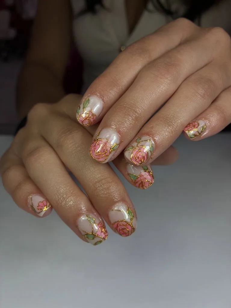
Photo via Instagram
The gold outlines are the structural element that transforms painted flowers into something more architectural — without them, the pink and green would read as watercolor blobs, but the gold lines define each petal and leaf with the precision of leaded glass. The sheer base allows skin tone to show through as the background of each composition, which keeps the overall effect light despite the density of the floral coverage. The variation in motif scale — full blooms alongside smaller buds — creates a natural hierarchy across the fingers, and the green leaves appear sparingly enough to provide contrast without introducing a competing color zone. This is nail art functioning closer to illustration than to polish application.
The strongest lesson is that outlined motifs on a clear base gain their structure from the outline rather than from the fill color. The gold lines here do what leading does in actual stained glass — they organize, define, and separate. Without that framework, the same floral elements would blur into each other and lose their individual clarity.
21. Warm Gradient From Orange to Burgundy
A hand shows four medium-length almond nails in a warm gradient sequence — the pinky in bright orange, moving through red-orange and true red on the middle fingers, to a deep burgundy or crimson on the index finger. Each nail is a single solid color with a glossy finish, and the gradient effect is achieved by the progression across fingers rather than blending within one nail. Silver stacked rings are visible, and one nail appears to carry a small gold sun or star motif.
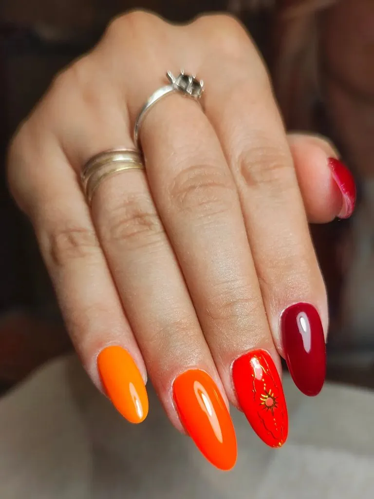
Photo via Instagram
The finger-to-finger gradient is a compositional strategy that treats the entire hand as a single canvas rather than each nail as an individual unit. The progression from orange through red to burgundy follows the natural color spectrum, which means each transition between fingers feels smooth even though the individual nails are solid blocks. The small sun motif on one nail adds a thematic whisper — warmth, fire, autumn light — without being literal or heavy-handed. The glossy finish keeps the warmer orange tones vivid and the darker burgundy deep, and the consistency of finish across all shades is what holds the gradient together as a unified idea.
The best move here is thinking of the hand as a gradient strip rather than five separate nail opportunities. By assigning each finger a different position on the warm spectrum and keeping all other variables identical — same shape, same finish, same length — the progression reads as designed rather than indecisive. That commitment to a single organizing idea across the full hand is what makes a multi-color set feel intentional.
22. Red Glitter Cat-Eye With Nude Accent
A hand displays short to medium square nails in two alternating designs. Some nails carry a deep red with a glitter or cat-eye finish that creates a bright metallic sheen across the surface. One nail — the middle finger — features a nude or beige base with no accent, acting as a break in the red sequence. The thumbnail, partially visible, appears red. The background shows a dark, bokeh-style surface.
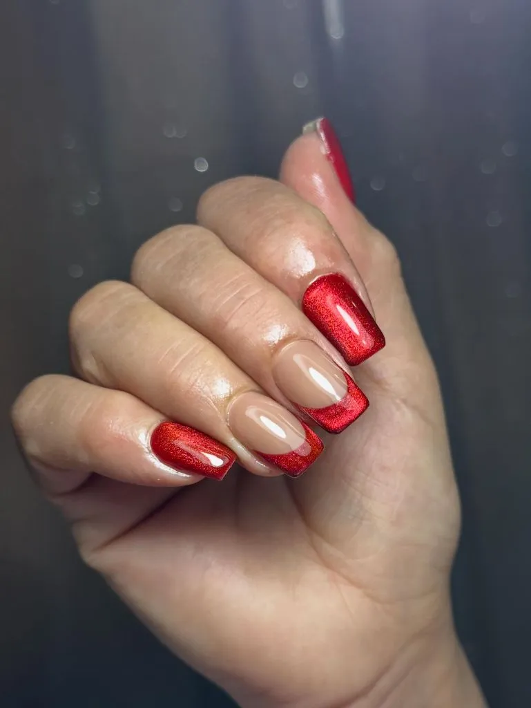
Photo via Instagram
The red glitter cat-eye finish is dense and reflective enough to make each red nail function almost like a small mirror catching light. The nude accent nail creates a deliberate pause in the sequence — a breath of skin tone between the red panels that prevents the hand from reading as a solid block of shimmer. The square shape gives the red nails clean, defined edges that frame the glitter effect within sharp boundaries, and the cat-eye streak adds directionality to what would otherwise be an all-over sparkle. The contrast between the high-energy red and the quiet nude is sharp, but the single nude nail is outnumbered enough that it reads as an intentional design choice rather than a missing coat.
The reader takeaway is that a single neutral nail within a bold set functions like a rest note in music — it gives the dominant color more impact by providing a moment of absence. That negative space principle applies broadly: any saturated, textured nail color statement gains definition when it includes one point of deliberate restraint.
23. Deep Teal With Nude French and Gold Star
A hand shows medium-length almond nails in a deep teal or dark emerald green with a glossy finish. One nail — the middle finger — features a nude base with a teal French-style tip and a small gold star or starburst charm placed near the cuticle line. The remaining nails are solid teal. A wrist tattoo is partially visible, and the background is a soft, blurred grey.
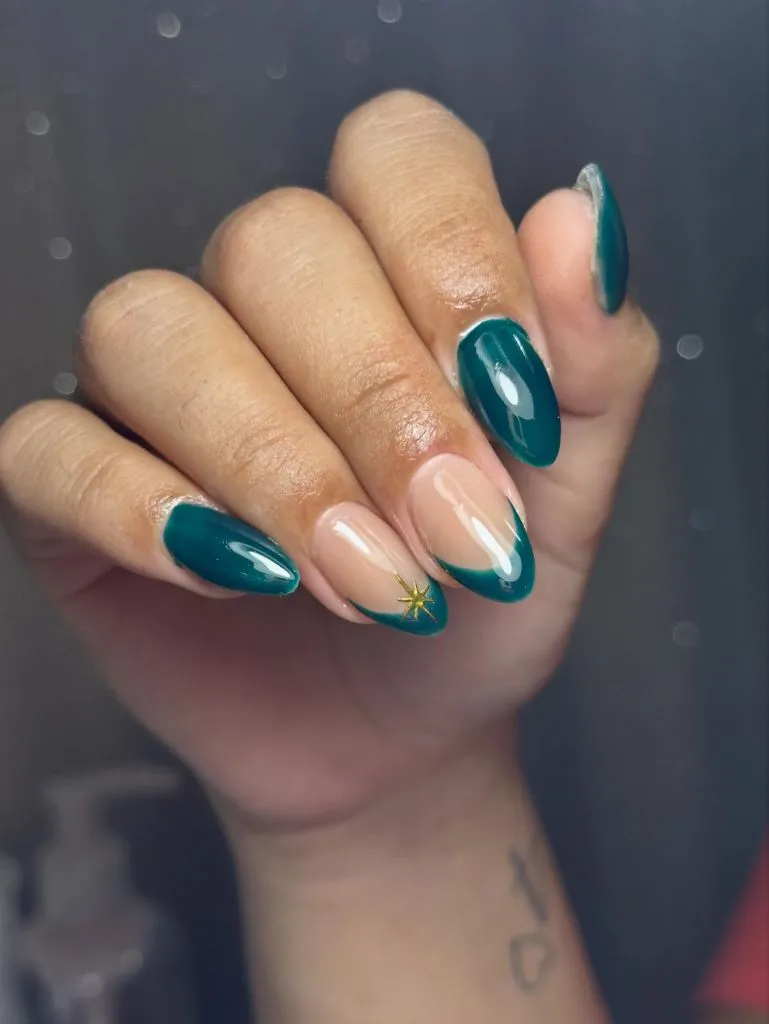
Photo via Instagram
The deep teal occupies a space that reads as neither blue nor green definitively, and that ambiguity gives it a richness that a cleaner shade would not possess. The accent nail inverts the full-coverage approach by placing the teal only at the tip, which reveals how the color reads differently in a thin band versus a full coat — thinner applications appear lighter and more translucent. The gold star charm sits at the cuticle rather than the tip, which reverses the expected focal point and draws the eye toward the base of the nail rather than the edge. That inversion of typical placement is what makes this particular accent nail feel fresh.
The useful idea is that placing a small embellishment at an unexpected position — here, the cuticle line rather than the free edge — can redirect how the viewer reads the entire nail. Conventional placement near the tip follows the eye’s natural drift, but anchoring detail at the base inverts that trajectory and creates a moment of visual surprise that rewards closer attention.

Hi, I’m Zoey Mitchell, the creator of ChicStyle Blog.
I share simple, wearable outfit ideas, hairstyles, nail trends, and beauty tips that feel natural and easy to recreate.
This blog is where I explore everything that makes a woman feel put together and confident every day. I’m not an expert — just a woman who genuinely loves style, mixing looks, and discovering what works.
If you love effortless fashion with a personal touch, you’ll feel at home here.