
There is a particular stillness to a hand held at rest when the nails carry something worth noticing. Almond nails have that quality built into their architecture, the way each tip narrows without arriving at a true point, the way color pools differently across a curved surface than it does on a flat square edge. That gentle taper changes everything about how a design reads, pulling pigment forward, softening hard graphics, and giving even a single accent nail a sense of direction.
What makes this shape worth studying is not a single rule but a set of variables that shift from hand to hand. The four this article returns to most often are proportion, meaning how the length of the extension relates to the nail bed and the width of the finger; contrast, meaning the distance between the lightest and darkest values on the same hand; placement, meaning where a motif, a color break, or a texture sits relative to the cuticle and the tip; and finish, meaning whether a surface reads as glass, velvet, frost, or something matte and organic. These four lenses apply whether the palette is a single nude or a full tropical scene, and they are what separate a design that photographs well from one that actually functions on a living hand moving through ordinary light.
1. Tropical Orange With Red Outline and Floral Accent
The set pairs a vivid orange that shifts toward coral at its warmest points with a deep red outline that traces the perimeter of every nail. Some nails carry the orange as a full wash, others leave a generous negative-space window through the center where bare pink nail bed shows. Two accent nails on the pinkies feature hand-painted red flowers with small rhinestone centers, and several nails include red linear swirl details layered over the orange.
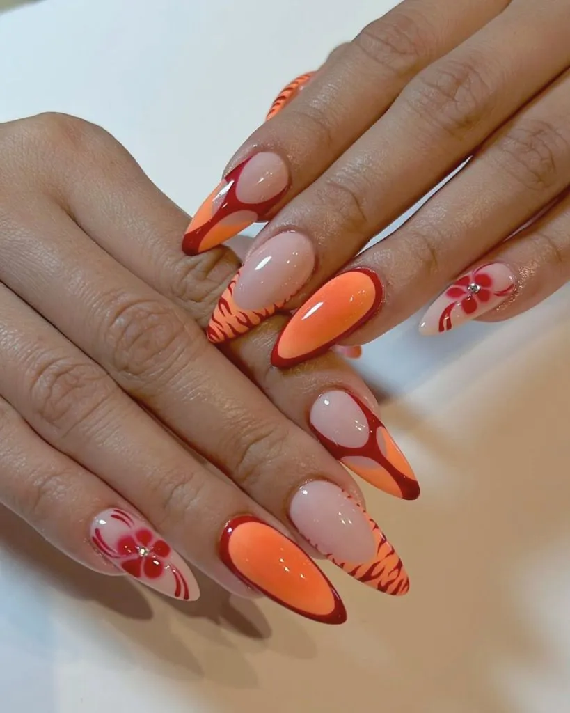
Photo via Instagram
The red outline functions as a frame, and that frame is what keeps the orange from floating. Without it, the warm pigment would blur into the skin at the sidewalls, but the thin border sharpens every edge and gives each nail a sticker-like precision. The eye moves first to the fully saturated middle finger, then jumps to the floral pinkies, and the negative-space nails in between act as breathing room. The contrast between filled and empty nails creates a rhythm that a full-coverage set would flatten. Color repetition between the outline and the flowers ties the design together without making it uniform, and the swirl details add a layer of movement that reads best in person when light catches the raised lines.
The reader takeaway is that outlining a bright color with a darker tone from the same family can anchor a design that might otherwise feel unfinished. That border principle works at any scale and with any palette, turning a simple color-block nail into something that reads as composed rather than casual.
2. Navy Tips With Gold Leaf Transition
Four nails are visible, each carrying a sheer pink base that transitions into deep navy blue at the tips. The blue sits in an angular, almost geometric French-tip shape rather than a smooth curve. Gold leaf fragments scatter across the boundary between the pink and the navy, concentrating most heavily at the transition line and thinning as they move toward the cuticle. The almond shape is medium length with a clean taper.
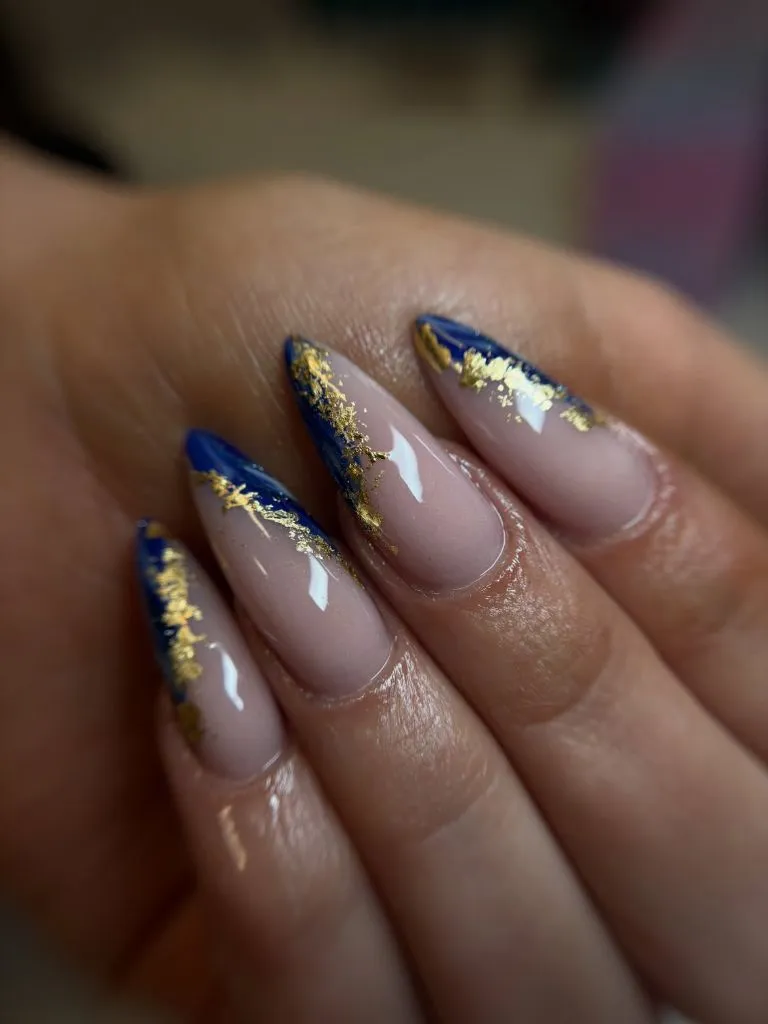
Photo via Instagram
What holds this design together is the gold leaf acting as a bridge between two surfaces that have almost nothing in common tonally. The sheer pink is warm and soft, the navy is cool and opaque, and the metallic fragments dissolve the boundary so neither zone feels hard-cut. The angular tip shape adds a modern edge that a round French line would not carry, and the almond silhouette softens that geometry just enough to keep it wearable. This kind of approach to nail color choices shows how a single metallic element can do the structural work of an entire accent nail.
The useful move here is placing the most decorative element exactly at the transition point rather than scattering it evenly. That concentrated placement gives the eye a clear focal zone while the rest of the nail stays quiet, and the same logic applies any time two contrasting colors share one surface.
3. Pink Glitter With Magenta Cat-Eye Depth
Every nail on this hand is coated in a deep rose-to-magenta glitter with a visible cat-eye light band running vertically down the center of each nail. The glitter particles are fine enough to create a velvet-like shimmer rather than individual sparkle points. The color shifts from a cooler pink near the cuticle to a warmer magenta at the free edge, and the light band sits slightly off-center on some nails. Two chunky gold rings are visible on the middle and ring fingers.
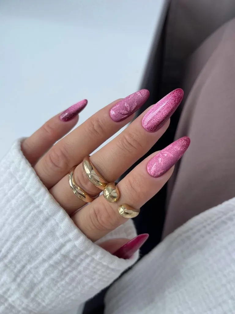
Photo via Instagram
The cat-eye band is what gives this monochrome set its architecture. Without it, the glitter would read as flat sparkle, but the magnetic stripe creates a vertical line that lengthens each finger and gives the eye a path to follow from cuticle to tip. The fine particle size keeps the texture sophisticated rather than craft-project, and the slight color shift from cool to warm adds depth that a single mixed shade would not produce. The gold rings echo the warmth in the magenta without competing for attention, sitting at the base of the fingers where they frame the nails rather than interrupt them.
The strongest lesson is that a single directional light effect can replace complex art when the goal is dimension. A magnetic top coat or a well-placed shimmer pigment creates the illusion of movement on every nail simultaneously, which gives a monochrome set the visual interest of a multi-design hand.
4. Olive Matte With Burgundy Ombre and Texture Dots
Two nails are visible in close focus. The index finger carries an olive-green matte surface with three raised gel dots arranged in a loose diagonal. The middle finger shows a gradient that moves from olive green at the tip through a pale gold midpoint into a deep burgundy at the cuticle, and its finish is satin rather than fully matte. A small decorative element sits near the cuticle of the thumb, partially visible, with a pink bead-like texture.
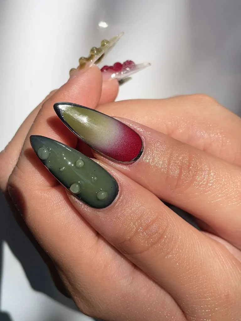
Photo via Instagram
The matte finish changes how the almond shape reads entirely. Glossy surfaces round the silhouette further, but matte flattens it, making the taper more visible and the edges more sculptural. The raised dots on the olive nail add a tactile element that the camera captures as shadow, and that shadow gives the flat surface a sense of depth it would otherwise lack. The ombre nail introduces a color story that feels autumnal without relying on literal leaf motifs, and the transition through gold keeps the shift from olive to burgundy smooth rather than muddy. Exploring ideas around seasonal style inspiration often leads back to this kind of understated tonal work.
What stands out most is the pairing of matte and satin finishes on the same hand. That finish contrast does the same visual work as a color contrast but with more subtlety, and it translates well to any palette where a single color family needs variety without adding a new hue.
5. Iridescent Ice Blue With Chrome Shift
Five nails are visible, all coated in a pale ice blue with a strong iridescent chrome finish that shifts to green and lilac depending on the light angle. The surface is perfectly smooth and mirror-like, with no visible texture or art. The nails are medium-long almonds with a gentle taper, and the color reads almost white in the highlights and pale aqua in the shadows. The hand rests on a light surface with soft natural light coming from the left.
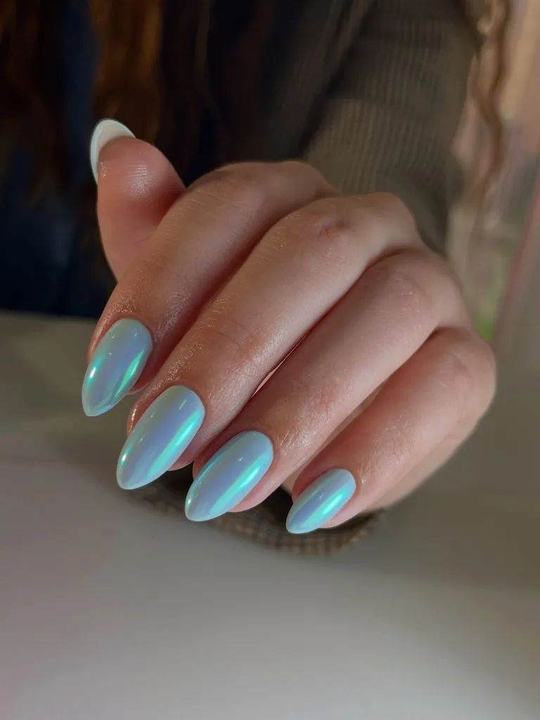
Photo via Instagram
The chrome finish does all the heavy lifting here, turning a color that could read as clinical into something almost holographic. Because the almond shape curves the surface in two directions, the chrome catches light in a way that flat or square nails cannot replicate, creating a unique gradient on each finger that changes with every movement. The absence of any art or accent nail is a deliberate choice that lets the finish function as the design itself. There is nothing competing for attention, and that restraint makes the color shift more visible and more compelling.
The useful idea is that a reflective finish on a pale base creates its own complexity without any hand-painted detail. When the shape and the surface treatment are strong enough, adding art would subtract from the design rather than build on it, and that principle holds for any color where the finish carries more visual weight than the pigment.
6. Watercolor Floral Tips With Pearl Accents
The nails feature a milky, semi-sheer base with soft watercolor-style blooms concentrated at the tips and near the cuticles. The flowers use muted tones of blue, burgundy, gold, and teal, applied in a diffused, painterly style rather than crisp outlines. Small pearl-like half-dome accents are placed on several nails, one per nail, positioned near the color clusters. The shape is a medium almond with a rounded, not pointed, tip. Gold rings with green and clear stones are visible on the hand.
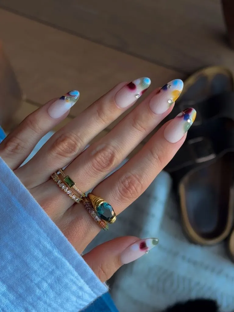
Photo via Instagram
The watercolor technique softens what would otherwise be a very busy design. Because the color bleeds outward without hard edges, each bloom feels like it was placed and then allowed to settle, which gives the whole set an organic, almost accidental quality. The pearls serve as anchors, small fixed points of brightness that the eye can land on between the diffused color clouds. Placement matters here more than palette, since the blooms sit at the extremes of the nail while the center stays bare, creating a frame-within-a-frame that the almond taper reinforces. This kind of considered floral approach connects to broader thinking about accessory and detail pairing.
The beauty of this is that controlled empty space in the center of each nail makes complex tip art feel calm rather than crowded. Leaving the mid-nail bare is a principle that works with any motif, from florals to geometric fragments, and it is especially effective on longer shapes where there is more real estate to protect.
7. Sheer Pink Base With Scattered Rhinestone Clusters
Both hands are shown with sheer, warm pink nails in a medium almond shape. Small rhinestones and iridescent crystal fragments are scattered across every nail, concentrated more heavily toward the tips and more sparsely near the cuticles. The stones vary in size, from tiny micro-crystals to slightly larger round rhinestones, and they catch light at different angles, creating a scattered-confetti effect. The finish underneath is glossy and the base color is barely there, almost a tinted clear.
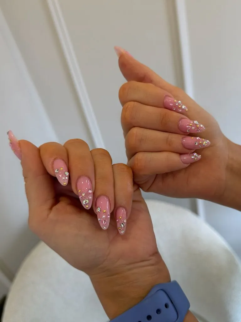
Photo via Instagram
The near-invisible base is what makes the rhinestones work. On a darker or more saturated surface, the scattered stones would compete with the color for attention, but against this barely-pink transparency, they become the only story. The gradient in density, thicker at the tips and thinner at the base, follows the natural taper of the almond shape and reinforces it, making each finger look longer. The variation in stone size prevents the pattern from reading as mechanical, and the iridescent finish on the crystals picks up whatever ambient light exists, so the effect shifts constantly.
The reader takeaway is that embellishment reads most intentional when it follows the geometry of the nail shape rather than fighting it. Placing density where the nail narrows and sparseness where it widens echoes the almond silhouette, and this density-gradient principle works with glitter, foil, or dried flowers just as well as with stones.
8. Matte Blush Base With Blue Linear Swirls
Five nails are visible on one hand, each carrying a matte blush-pink base with thin, flowing blue lines drawn in a continuous swirl pattern. The lines are a bright sky blue with consistent width, and they loop and curve across the nail surface without crossing themselves. The finish is clearly matte, with no shine on the pink base, though the blue lines appear to have a slight sheen. The nails are medium-length almonds. Silver rings in abstract organic shapes are worn on the index and middle fingers.
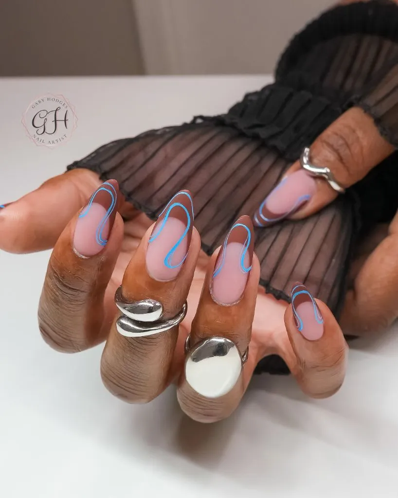
Photo via Instagram
The matte-on-slightly-sheen contrast between the base and the lines is subtle but structurally important. It means the blue swirls catch light independently of the pink surface, so they appear to float slightly above the nail rather than sit flat on it. The continuous line pattern connects each nail to the next when the fingers are together, creating a visual flow across the hand that individual motifs would not achieve. The silver rings support the cool-toned palette without adding warmth that would distract from the blue-on-pink dialogue. Thinking about how minimal design details function on their own terms helps clarify why restraint in line weight matters so much.
The best move here is using a single continuous line rather than multiple separate marks. That unbroken path creates movement across the nail surface and ties the hand together as a composition, and it works with any two-color combination where one shade is reserved for structure.
9. Green Jade With Gold Chrome Border
Both hands display long, stiletto-leaning almond nails coated in a milky jade green with a visible depth that suggests a jelly or translucent base. Every nail is bordered by a thin gold chrome outline that follows the entire perimeter, from cuticle edge to tip. The green has a slight inner glow, lighter at the center and deeper at the edges, creating a stone-like or gem-like appearance. The surface is glossy and smooth.

Photo via Instagram
The gold border performs the same function as a jewelry setting, and that analogy is not accidental. By framing the green surface on all sides, the chrome line turns each nail into something that reads as a mounted stone rather than a painted surface. The translucent quality of the green amplifies this effect because light enters the polish layer and bounces back with depth, exactly the way a cabochon jade catches light. The long almond taper gives the gold line more distance to travel, which makes the framing more dramatic than it would be on a shorter nail. This approach to treating the nail as a jewelry-like focal point speaks to how finish and framing can shift an entire perception.
The useful move here is that a metallic perimeter line on a translucent base creates the impression of a precious object. That border technique works on any shape but gains the most impact on almonds and stilettos where the taper gives the frame a directional point.
10. Charcoal Glitter With Negative-Space Curves
Four nails are visible on one hand. Three carry a full coating of dark charcoal glitter with fine silver micro-shimmer throughout. The ring finger features a negative-space design where pink bare nail is visible through organic, wave-like cutouts, with the charcoal glitter filling the surrounding areas. The glitter has a dimensional quality, shifting between dark gray and silver depending on the light. Gold stacking rings sit at the base of the fingers.
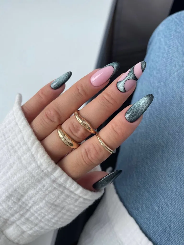
Photo via Instagram
The negative-space accent nail is the pivot of the entire set. Without it, the charcoal glitter would read as dramatic but uniform, and the design would flatten into a single dark statement. The exposed pink nail bed inside the wave shapes introduces warmth and softness into an otherwise cool palette, and the curves themselves echo the almond taper, making the design feel native to the shape rather than imposed on it. The gold rings pick up the warm undertone of the bare nail and extend it below the nail line, anchoring the hand in warmth even as the dominant color stays cold. Ideas around balancing dark and light elements often center on exactly this kind of strategic reveal.
The strongest lesson is that one accent nail with exposed base color can soften an entire dark set without diluting its impact. The negative-space technique works as a pressure valve, releasing visual tension that would otherwise make a monochrome glitter hand feel heavy.
11. Soft Pink French With Pearl Cuticle Detail
Three nails are clearly visible. Two carry a soft pink shimmer with fine gold micro-glitter dispersed through the polish, creating a warm glow rather than distinct sparkle points. The third nail, in the center, is a classic French manicure with a clean white tip over a sheer pink base, and a tiny row of pearl-like beads sits in a curved line just above the cuticle. The shape is a clean medium almond, and the overall impression is bridal and refined.
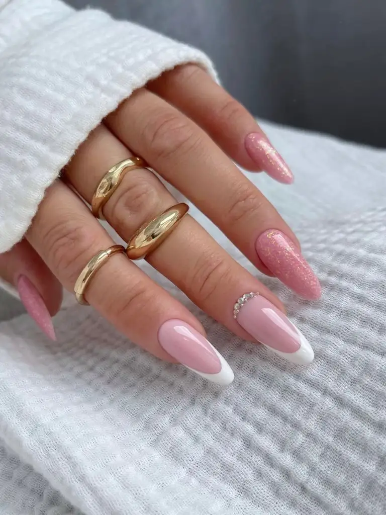
Photo via Instagram
The pearl cuticle detail is placed at the one point on the nail where it will not compete with the white tip, and that placement shows a strong understanding of visual hierarchy. The eye reads the French tip first because it sits at the point of the almond, then travels back to the cuticle where the pearls wait as a quiet reward. The shimmer nails flanking the French accent create a tonal bridge, warm enough to feel cohesive with the pearls but not so decorative that they compete with the detailed center nail. The entire hand reads as a composition where each nail has a role rather than a hand where every nail tries to be the focal point.
What stands out most is the use of the cuticle zone as a placement area for detail. Most designs concentrate embellishment at the tip or across the full surface, but anchoring the pearls at the base reverses the expected visual flow and makes the French tip feel less predictable.
12. White French With Black Polka Dot Overlay
Five nails are visible, each combining a sheer pink base with white French tips and a pattern of small, evenly spaced black polka dots covering the entire nail surface from cuticle to free edge. The dots sit over both the pink and white zones, unifying the two areas into a single patterned field. The shape is a medium almond with a soft, rounded point. Pearl rings are visible on the hand, matching the pale palette.
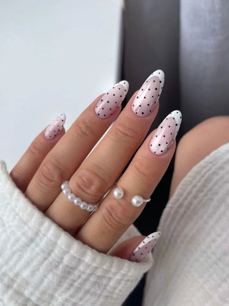
Photo via Instagram
The polka dots perform a unifying function that is easy to overlook. Without them, the white French tip and pink base would create a two-zone nail, which is the standard French construction. But by laying the dot pattern over both zones, the design merges them into a single surface where the French tip becomes a subtle value shift underneath rather than a hard border. The dots themselves are small and evenly spaced, which keeps the pattern from feeling playful or childish and pushes it toward something more graphic. The pearl jewelry echoes the dot scale, creating a textural conversation between the hand and the nails that feels deliberate. Approaches like this connect to ideas about pattern and proportion in styling.
The useful idea is that laying a uniform pattern across a two-tone base collapses the boundary between zones and creates a more integrated design. This overlay principle works with stripes, checks, or any repeating motif, and it is especially effective at making a familiar construction like the French tip feel less expected.
13. Lilac Glitter French With Matte Base
Five nails show a soft matte lilac-pink base with a glitter French tip that uses the same lilac tone but in a sparkle-loaded version. The transition between the matte base and the glitter tip is organic and wave-like rather than a crisp French line, creating a soft boundary that follows the nail’s natural curve. The almond shape is medium length, and the glitter particles are fine and densely packed. Gold stacking rings sit on the middle and ring fingers.
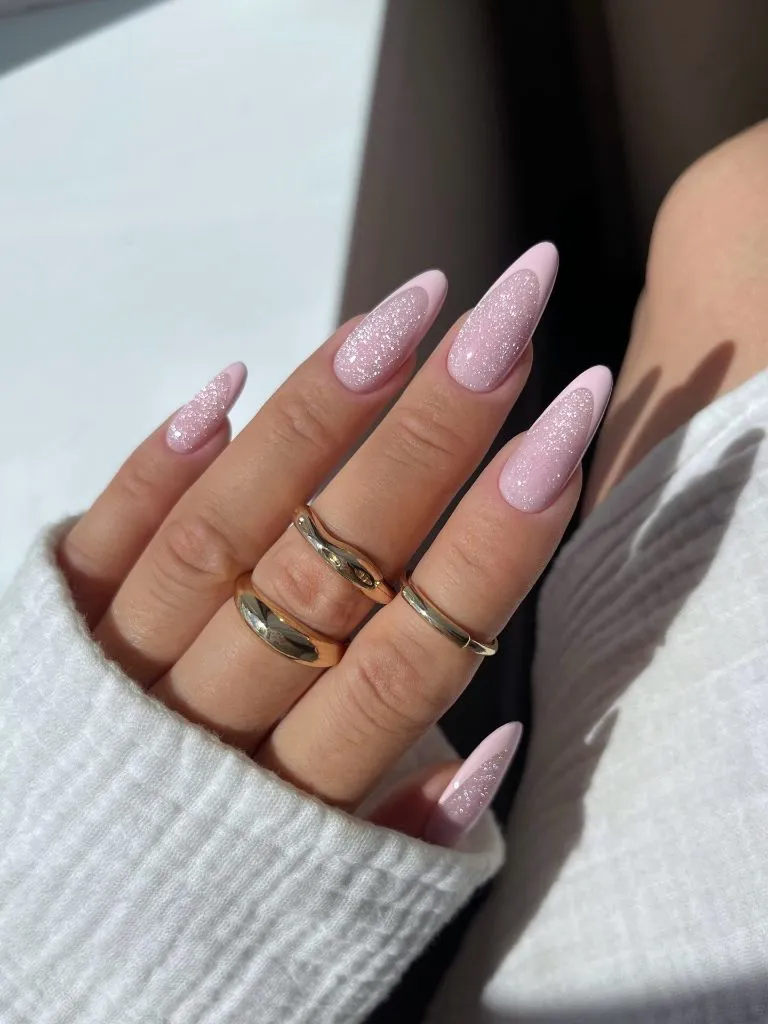
Photo via Instagram
The tonal matching between base and tip is the key structural decision. Because both zones use the same lilac family, the contrast comes entirely from finish rather than color, which creates a quieter, more sophisticated version of the French construction than a color-blocked approach would. The organic transition line adds a hand-done quality that a crisp tape line would erase, and it allows the glitter to bleed slightly into the matte zone, which softens the boundary further. I find that this kind of finish-only contrast often photographs even better than it looks in person, because the camera exaggerates the difference between matte and sparkle in a way that emphasizes the design’s architecture.
The reader takeaway is that matching the color between base and tip while changing only the finish creates a French variant that feels modern without abandoning the original structure. This tonal-French approach is transferable to any shade, from deep burgundy to pale nude, and it rewards the almond shape specifically because the taper directs attention toward the glitter zone.
14. Green French Tips With Hand-Painted Floral Art
Both hands display long almond nails with pale lime-green French tips and hand-painted floral motifs. The flowers use soft pink and white petals with dark green leaves, positioned so they cross the boundary between the bare nail bed and the green tip. Some nails carry a single bloom, others show petals extending across the full surface. The base is sheer and natural, and the green tip has a clean, opaque edge. A watermark reading “Nails by Keti” is visible in the upper left corner.
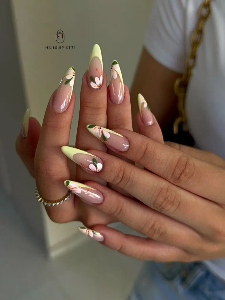
Photo via Instagram
The florals are placed to break the French line deliberately, and that breakage is what keeps the design from reading as two separate ideas. If the flowers sat entirely within the green tip or entirely on the pink base, the nail would feel like a French manicure with a sticker on top. But because the petals and leaves cross the boundary, they stitch the two zones together into a single scene. The lime green reads as fresh and seasonal without relying on literal seasonal imagery, and the dark green leaves provide enough tonal weight to keep the pale flowers from floating. This way of thinking about layered nail art composition rewards patience in placement over speed in execution.
The best move here is placing motifs across a color boundary rather than within a single zone. That crossing creates visual integration and prevents a multi-element design from fragmenting into separate parts, and it applies equally to abstract shapes, linework, or any hand-painted detail.
15. Periwinkle Blueberry With Three-Dimensional Fruit Accents
Five nails are visible, combining a soft periwinkle-lavender base with hand-painted and three-dimensional blueberry motifs. Some nails carry raised gel blueberries with tiny green leaves, others show painted clusters with white dot accents, and at least one nail features a marble-like swirl pattern in blue and white. The base color shifts between a full-coverage periwinkle and a lighter lavender half-and-half split. The almond shape is medium with a gentle taper.
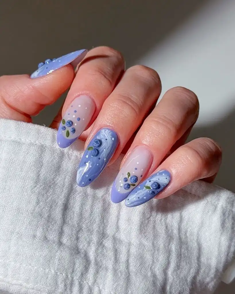
Photo via Instagram
The three-dimensional elements raise the design above the nail surface literally, and that elevation creates shadow, which adds a layer of visual depth that flat nail art cannot achieve. The blueberries are small enough to stay proportional to the nail, which is a critical detail since oversized 3D elements can look heavy and catch on things. The mix of techniques across the hand, raised fruit on one nail, flat painting on another, marble swirl on a third, keeps each nail distinct while the shared periwinkle palette holds them together. The white dots serve as highlights that unify the different techniques by appearing in both the painted and dimensional versions.
The useful move here is mixing dimensional and flat techniques within a single palette to create variety without chaos. The shared color family does the cohesion work while the technique variation provides interest, and this principle scales well to any theme where a single motif appears across multiple nails.
16. Butterfly Wing French Tips on Sheer Base
Both hands show long almond nails with sheer, natural-pink bases and French tips painted to resemble butterfly wings. The wing patterns use deep brown, teal, burgundy, and touches of yellow-green, with veined lines mimicking the structure of actual wing segments. Each nail carries a slightly different section of the wing pattern, as if the full butterfly were distributed across the hand. The nails are notably long with a sharp almond taper.
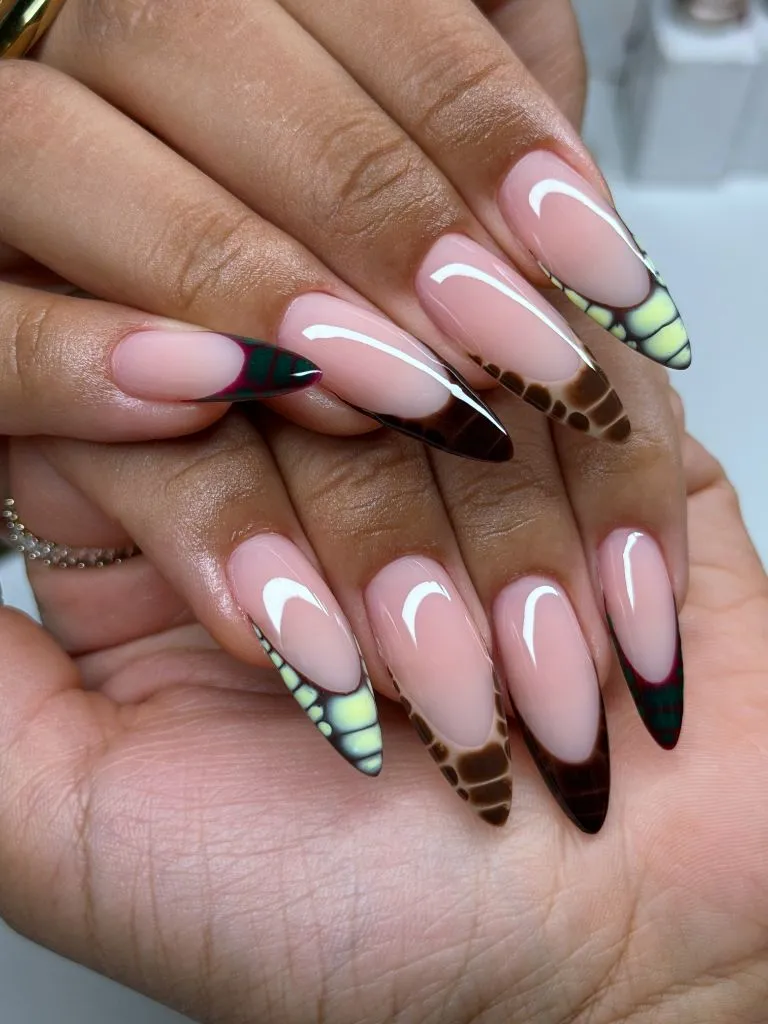
Photo via Instagram
The distributed-wing concept is what makes this design cohesive rather than repetitive. Each tip reads as a fragment, and the brain wants to assemble them, which means the eye moves constantly across the hand looking for connections. The sheer base is essential because it provides the breathing room that the complex tips demand, and its transparency means the tips appear to float at the ends of the fingers rather than sitting on a colored field. The color palette within the wings, those deep browns and teals, avoids the bright primary colors typically associated with butterfly nail art, which pushes the design toward something that feels naturalistic rather than decorative. Thinking about how creative French tip variations can carry narrative across a full hand opens up this kind of distributed approach.
The strongest lesson is that distributing a single image across multiple nails creates visual movement that a repeated motif cannot. Each nail becomes a piece of a larger composition, and the hand itself becomes the canvas rather than any individual finger.
17. Deep Red and White With Mixed Motif Storytelling
Both hands display almond nails in a deep cherry red and white palette with a different motif on nearly every nail. Visible designs include tiny cherry illustrations, a bikini outline, abstract symbols that could read as zodiac or astrological marks, cloud-like scallop shapes, and small rhinestone accents. Some nails are fully red, others are white with red line art, and the overall effect is a curated collection of illustrations sharing a strict two-color palette.
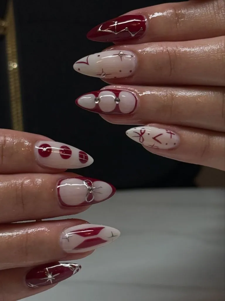
Photo via Instagram
The strict two-color discipline is the structural backbone of this set. Without it, the variety of motifs would fragment into visual noise, but because every element uses the same red and white, the hand reads as a curated editorial page rather than a random assortment. The bikini outline and cherry illustrations suggest a playful thematic link, though the symbols and abstract shapes keep the narrative loose enough that it reads as mood rather than costume. The rhinestones appear on only one or two nails, providing just enough dimension to break the flat graphic plane without overwhelming the illustrations. Ideas about building a cohesive look through color discipline often start with exactly this kind of tight palette commitment.
The reader takeaway is that a strict color limit allows maximum freedom in motif variety. Two colors, no matter how many different images they carry, will read as a single coherent set, and this principle is the fastest route to a mixed-motif hand that still feels intentional.
18. Warm Earth Tones With Blooming Flower and Croc Texture
Four nails are visible in a warm palette of brown, burgundy, and muted blue. One nail carries a blooming-gel flower with dark petals that bleed outward from a gold center. Another shows a crocodile-skin texture in deep purple-brown. A third features a gold outline on a sheer base, and the fourth displays a partial bloom with dark spots resembling a tortoiseshell or animal-print fade. The finish varies between glossy and slightly textured, and the almond shape is short to medium.
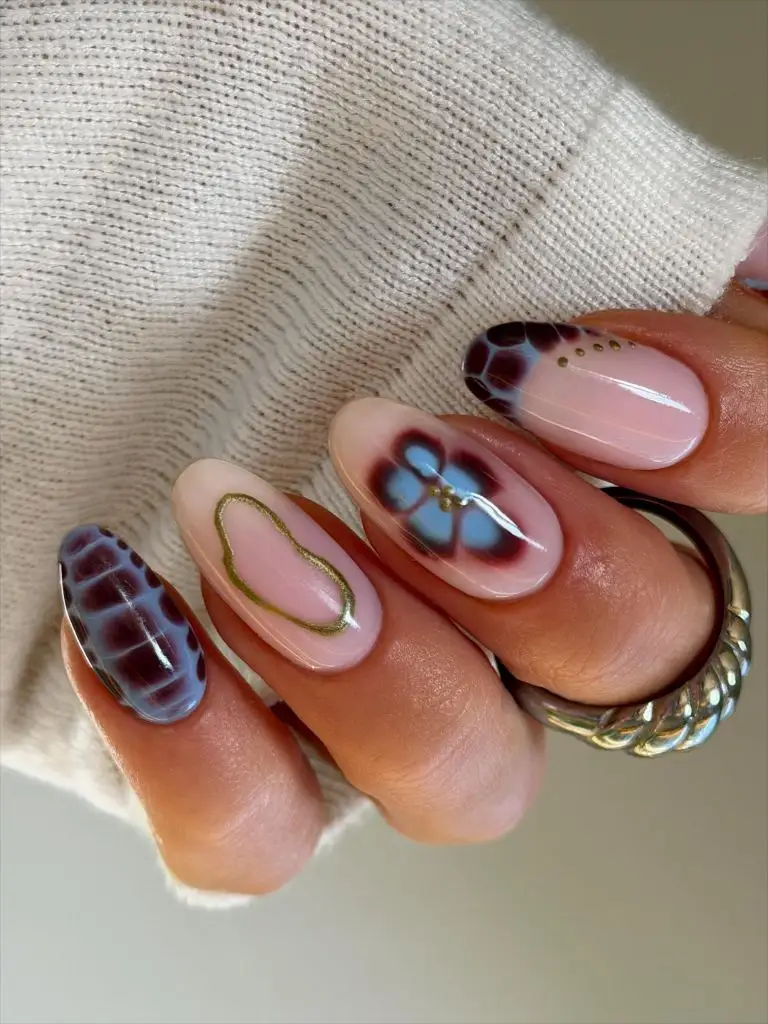
Photo via Instagram
The technique variety across this hand is significant, moving from blooming gel to textured embossing to clean line art, yet the warm-earth palette prevents any nail from feeling like it belongs to a different set. The crocodile texture is the most unexpected element, introducing a fashion-reference that reads as luxe rather than literal, and its dark tone anchors the hand tonally while the lighter sheer nail and gold outline provide lift. The blooming flower’s soft edges contrast with the hard geometry of the croc scales, and that contrast in technique keeps the eye moving between fingers. The gold outline nail acts as a visual rest point, simple enough to separate the two more complex nails flanking it.
What stands out most is the use of texture contrast as a compositional tool alongside color. Combining embossed, bloomed, and flat-line techniques on the same hand creates a tactile variety that a photograph captures as shadow and depth, and that approach works any time a palette is too narrow for color variation alone.
19. Nude Shimmer With Warm Gold Micro-Glitter
Five nails are visible, all coated in a sheer nude pink with warm gold micro-glitter dispersed throughout. The glitter is extremely fine, reading more as a golden glow than individual particles, and the finish is glossy. The almond shape is medium with a natural, not dramatic, taper. The nails are relatively short compared to other sets in this collection, sitting just past the fingertip. Natural sunlight hits the nails from the side, illuminating the gold particles unevenly.
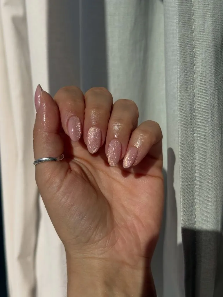
Photo via Instagram
The simplicity here is the point, and it works because the gold micro-glitter does just enough to separate this from a bare nail without announcing itself. In direct sunlight, the particles catch and scatter light in a way that a plain nude polish cannot, creating a warmth that reads as healthy and luminous rather than decorated. The shorter length keeps the look grounded, and the almond shape, even at this modest extension, still narrows the fingertip enough to create the characteristic silhouette. This kind of understated nail approach pairs naturally with thinking about everyday styling that still carries intention, where the goal is refinement rather than statement.
The beauty of this is that the smallest possible intervention, a fine glitter in a matching tone, can transform a nude nail from invisible to intentional. The lesson scales downward as well as upward, meaning the same logic applies when choosing between a plain black and a black with a subtle micro-shimmer.
20. Hot Pink French With Three-Dimensional Bow
Four nails are visible with a sheer, light pink base and vivid hot-pink French tips. One nail, likely the ring finger, carries a small three-dimensional white bow attached at the base of the nail near the cuticle. The French-tip line is slightly thicker than a traditional French and curves naturally with the almond shape. The hot pink is fully opaque and saturated, creating a sharp contrast against the near-transparent base. Sparkly fabric is visible on the wrist area, suggesting a glittery sleeve or accessory.
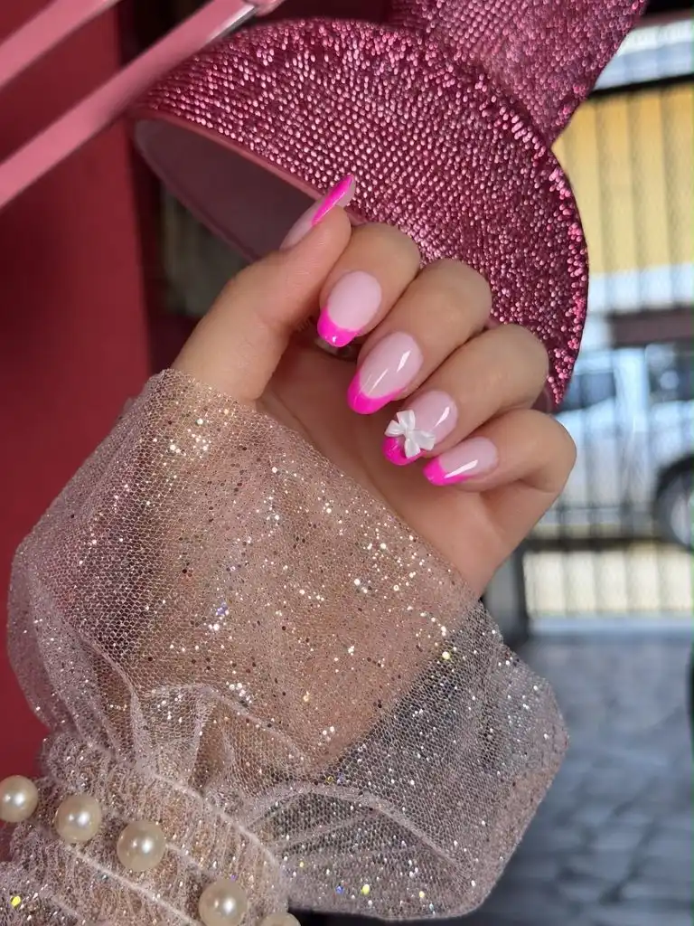
Photo via Instagram
The white bow functions as both a textural and tonal interruption. Against the hot-pink-and-sheer scheme, it introduces a third surface, opaque white with dimension, that breaks the two-tone rhythm just enough to create a focal point. Its placement near the cuticle rather than at the tip is a deliberate inversion of where the eye expects to find the most saturated element, since the hot pink already commands the tips. The thicker French line increases the ratio of color to transparency on each nail, which makes the overall impression bolder than a traditional fine-line French, and the almond shape contains that boldness by funneling it toward a soft point rather than a blunt edge.
The useful idea is that a single dimensional accent placed opposite the dominant color zone creates balance across the nail. When the tips carry the strongest color, putting the ornament at the base distributes visual weight evenly, and this placement logic applies to rhinestones, charms, or any three-dimensional addition.
21. Pink and Red Coquette With Strawberry and Bow Details
Four nails are visible on one hand in a pink and deep red palette. One nail features a hand-painted strawberry cross-section in red on a pink base. Another shows a polka-dot French tip in red and white. A third carries a hand-painted pink bow. The fourth has a deep red French tip. The designs are varied but unified by the pink-to-red tonal range, and the nail shape is a soft, medium-length almond. Delicate gold rings with vine and chevron details are visible on the fingers.
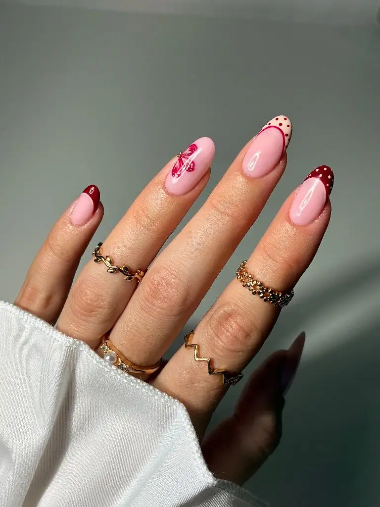
Photo via Instagram
The coquette references, the bow, the strawberry, the polka dots, are individually quite sweet, but the deep red keeps them from reading as purely playful. That tension between sweetness and depth is what makes the set work as a composition. The strawberry cross-section is a particularly effective motif because its circular shape contrasts with the almond taper, creating a visual friction that holds attention. The polka-dot tip introduces a pattern element that connects to the round shapes of the strawberry and the bow loops, building a subtle geometry across the hand. Approaches that explore mixing playful and sophisticated elements often find their strength in exactly this kind of tonal range control.
The best move here is that keeping the base palette within a single warm family allows figurative motifs to coexist without competing. The strawberry, the bow, and the dots could fragment on a wider palette, but the pink-to-red gradient holds them together as chapters of a single visual story.

Hi, I’m Zoey Mitchell, the creator of ChicStyle Blog.
I share simple, wearable outfit ideas, hairstyles, nail trends, and beauty tips that feel natural and easy to recreate.
This blog is where I explore everything that makes a woman feel put together and confident every day. I’m not an expert — just a woman who genuinely loves style, mixing looks, and discovering what works.
If you love effortless fashion with a personal touch, you’ll feel at home here.